
Website popups are an easy way to generate leads and convert visitors into customers. They’re bright, eye-catching, and attention-grabbing.
They can also be used to show relevant content, such as a coupon or email signup form. Skims uses a location-based popup to inform users from different countries that their company ships worldwide.
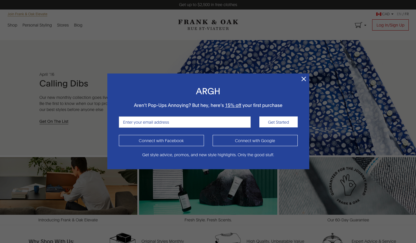
Email Popups
Email popups are a great way to build your email list by capturing website visitors who are interested in your brand and content. When designed well, they can boost signup rates by 2-3 times compared to inline opt-in forms. However, you must create a lead magnet that is enticing enough to encourage people to share their contact details. For ecommerce stores, this usually means offering a discount. But it doesn’t have to be just a flat 10% off—you can offer anything that will add value to your subscribers.
A well-designed email popup should be eye-catching, attractive and match your brand design. It should also have a clear call to action that makes it easy for your visitors to subscribe to your emails. You should also limit the number of input fields that you ask your visitors to fill in as too many can put them off and discourage them from providing their email addresses. Pipcorn, for example, uses a single input field in their subscription popup that seems simple and inviting.
The visuals of your email popup can be just as important as its marketing copy. Using high-quality images and videos in your popup can make it look professional and trustworthy. These can also help reinforce the message that you will send your subscribers valuable content. Alternatively, you can use photographs of team members to establish a personal connection and reassure visitors that it’s safe to provide their contact details.
Announcements
A website popup can be a great way to alert visitors to important business announcements. These messages can be in the form of emails, social media posts or blog updates, and they can drive traffic to your website and help maximize revenue opportunities.
The most common type of website popup is the entry popup, which appears as soon as a visitor visits a page. This is often used on news sites asking for subscriptions, or e-commerce websites encouraging signups and purchases. It can also be used to display important information, like the closing of a sale or a change in store hours.
Another common type of website popup is the timed popup. These appear after a visitor has been inactive on a website for a set amount of time. This can be used to ask for email addresses or to offer a discount coupon. Crocs uses this approach to encourage users to download their app.
The most effective website popups are ones that are both informative and persuasive. They should highlight a clear call to action and explain the value of signing up. In addition, they should also be easy to use. This is why using a no-code popup builder that offers A/B testing is so important. For example, MailerLite allows you to create two different versions of your form and show each to a group of website visitors. This way, you can see which version converts best and roll it out to your entire website audience.
Call to Actions
Website popups can boost conversion rates when used correctly, but they can also be frustrating for visitors if they’re overused or overly intrusive. At their best, these types of popups prompt users to take the next step that will help them move closer to a purchase or meet a goal.
Time-based popups:
The most common type of web popup is a timed one that appears once the user has been on a page for a set amount of time. It’s a great way to prompt action or a natural next step, like signing up for an email list or buying a product. However, if the time-based popup isn’t relevant to the content on the page, it can be annoying to users and may push them away from your website.
Announcement popups:
Many businesses use announcements to stay in contact with their audience, but long forms that ask for a user’s email address can turn people off. Instead, try offering something that adds value to the user’s experience and encourages them to give you their information willingly.
For example, Glossier uses humor and a call to action that makes joining their email list seem like the right next step for any visitor. Other brands use location-based personalization, like when Skims asks visitors from different countries to choose their preferred shipping method.
Conversions
Many websites use popups to generate email subscribers and build relationships with visitors. These can also be used to promote special offers and new products. When used properly, they can boost conversion rates and improve SEO. However, too many popups can be intrusive and create a bad user experience. Intrusive automatic popups can cause users to click away from a website or even abandon the site completely. They also interfere with the browsing experience of mobile users. Moreover, flashing sounds can startle and annoy visitors.
The best way to convert a website visitor is by displaying a relevant message in a non-intrusive manner. For example, if your products are expensive, you can use a “downsell” message to offer a lower-priced product. This can help increase sales and customer retention. You can also monitor how far a user has scrolled and display a web popup when they reach the end of a section.
Other website popups can target specific visitor groups, such as first-time visitors or returning visitors. These can be more effective than a general banner that displays to everyone. In this way, you can target the most relevant messages to each audience.
This popup by Glossier uses humor to encourage visitors to sign up for the brand’s newsletter. It also promises exclusive content. This strategy works well for a personal, intimate brand such as this one. Similarly, Tomtop’s popup asks users to confirm their location to ensure they receive accurate shipping information.